This is another in my series of blogs where I take a deep dive into converting a customized R graph into a SAS ODS Graphics graph. This time the example is a needle plot (that's essentially like a bar plot, with lots of tiny bars, plotted along a continuous xaxis).
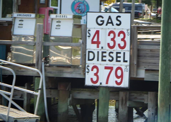
With all the speculation and uncertainty about future gasoline prices in the US, I decided to use historical gasoline price data for this example. And to get you in the mood for plotting this data, here is a picture my boating friend Paula took along the Intracoastal Waterway in South Carolina. Can you guess when she took this picture?
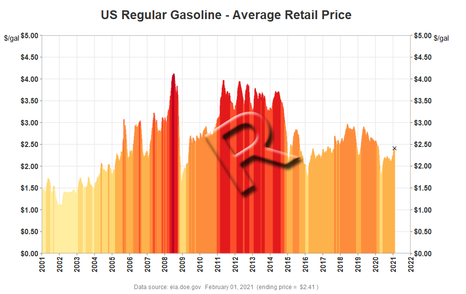
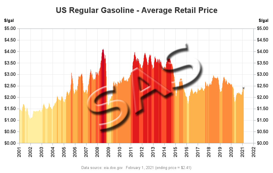
I'll be plotting the U.S. average gasoline price, from the year 2001, to the current value. The height of the 'needle' bars represents the price, and I make the graph a bit easier to read by coloring the needles based on the gasoline price - at each 50 cents higher price, a darker shade of red is used. Below are the two comparable graphs, created using R and SAS.
R Graph, created using ggplot()
SAS Graph, created using Proc SGplot
My Approach
I will be showing the R code (in blue) first, and then the equivalent SAS code (in red) I used to create both of the graphs. Note that there are many different ways to accomplish the same things in both R and SAS - and keep in mind that the code I show here isn't the only (and probably not even the 'best') way to do things. If you know of a better/simpler way to do these things, feel free to share in the comments (note that I'm looking for better/easier-to-follow/best-practices - not just different/shorter but more obscure code!).
Also, the code below is sometimes not presented in the same order I ran it in to create the graphs (so you won't be able to simply copy-n-paste it and run it). And I don't include every bit of code here in the blog (in particular, pieces I've already covered in previous blog posts). I include links to the full R and SAS programs at the bottom of the blog post, that you can download and run.
Getting The Data
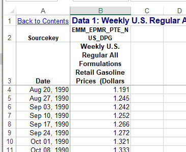
The data for this example comes from the U.S. Energy Information Administration. After a bit of searching, I found the data I wanted on the following page. There is a link for downloading the data as an Excel spreadsheet, and I use that URL in the code below. Here is a screen-capture of what the data looks like in the Excel spreadsheet:
In R, I place the URL into a variable I call 'url', and then use the get() function to get the file from the web, and save in into my account's temporary space using a unique random filename (for example C:\Users\realliso\AppData\Local\Temp\Rtmp00msAp\file65acd695b4e.xls). I save the temporary filename in a variable called 'tf', and then feed that into the read_excel() function, telling it to read the data from the "Data 1" sheet, and skip the first 2 lines.
#install.packages("tidyverse")
library(readxl)
library(httr)
url <- "https://www.eia.gov/dnav/pet/hist_xls/EMM_EPMR_PTE_NUS_DPGw.xls"
GET(url,write_disk(tf<-tempfile(fileext=".xls")))
my_data <- read_excel(tf,sheet="Data 1",skip=2)
In SAS, I use a filename statement to create a filename called 'xlsfile' which points to the URL where the Excel file is stored. I then use a data step to download that file and save it into the current directory (using the same Excel filename, rather than a random/unique name). I then use Proc Import to read the Excel data and save it as a SAS dataset called my_data. Note that the range statement lets me specify the Excel sheet, and range of cells to read (in 'B0' the B is the column name, and the 0 tells it to read until the data stops).
%let xlsname=EMM_EPMR_PTE_NUS_DPGw.xls;
filename xlsfile url "https://www.eia.gov/dnav/pet/hist_xls/&xlsname";
data _null_;
n=-1;
infile xlsfile recfm=s nbyte=n length=len _infile_=tmp;
input;
file "&xlsname" recfm=n;
put tmp $varying32767. len;
run;
proc import out=my_data datafile="&xlsname" dbms=xls replace;
range="Data 1$A4:B0";
getnames=NO;
run;
Preparing The Data
In the R code below, the first line assigns mnemonic names to the two variables read in from the spreadsheet. The second line creates a date variable from the date_time variable. The third line determines which price range the price is in, which I'll use later to color the needles/bars (each 50 cent increment will use a darker shade of red). And the last line subsets the data to limit it to only the data from 2001 onward.
names(my_data) <- c("date_time","gasoline_price")
my_data <- my_data %>% mutate(date=as.Date(date_time))
my_data <- my_data %>% mutate(price_range=as.character(as.integer(gasoline_price/.50)))
my_data <- my_data[my_data$date>="2001-01-01",]
In SAS, I use the rename= statement to rename the variables in the dataset. The Excel dates are read in as dates in SAS (whereas R read them in as datetime), therefore I don't need to convert them. I use a simple equation to assign the price range which I'll use to color the needles. And an if statement lets me keep only the data from 2001 onward.
data my_data; set my_data (rename=(a=date b=gasoline_price));
price_range=int(gasoline_price/.50);
if date>='01jan2001'd and gasoline_price^=. then output;
run;
Plotting The Data
In R, I use the ggplot() function, and tell it the name of my data, x & y variables, and a color variable in the aes() part. I then use the geom_col() function to draw the needles.In this case, the needles are so tightly packed together, the visual effect is solid areas of color (this is the visual effect I wanted).
my_plot <- ggplot(my_data,aes(x=date,y=gasoline_price,color=price_range)) +
geom_col() +
In SAS, I use Proc SGplot, identify my dataset using data=, and then use a needle statement, where I identify my x and y variables, and the group= (which controls the color).
proc sgplot data=my_data noautolegend;
needle x=date y=gasoline_price / group=price_range;
Controlling The Colors
In R, I specify a color for each of the possible values of the price_range variable (1-9), using the scale_color_manual function.
scale_color_manual(values = c(
"1" = "#FFFFCC",
"2" = "#FFEDA0",
"3" = "#FED976",
"4" = "#FEB24C",
"5" = "#FD8D3C",
"6" = "#FC4E2A",
"7" = "#E31A1C",
"8" = "#BD0026",
"9" = "#800026"
)) +
In SAS, I create an attribute map map dataset, which maps the price_range values (1-9) to the desired linecolors. Since an attribute map dataset can contain attributes for more than one thing, you also have to create an ID variable, which you later specify as the attrid= when you run SGplot.
data myattrmap;
length linecolor $9;
input ID $ value linecolor $;
datalines;
myid 1 cxFFFFCC
myid 2 cxFFEDA0
myid 3 cxFED976
myid 4 cxFEB24C
myid 5 cxFD8D3C
myid 6 cxFC4E2A
myid 7 cxE31A1C
myid 8 cxBD0026
myid 9 cx800026
;
run;
proc sgplot data=my_data dattrmap=myattrmap noautolegend;
needle x=date y=gasoline_price / group=price_range attrid=myid;
Rotating Xaxis Years
By default, the year values along the Xaxis are horizontal. I would typically leave them in the horizontal orientation because they are easier to read that way ... but the year values get a bit crowded in this particular graph, therefore I rotate them 90 degrees. In R, I do that by specifying an angle in the theme for the axis.text.x.
theme(axis.text.x=element_text(face="bold",color="#333333",size=11,angle=90,vjust=.5))
In SAS, I specify options on the xaxis statement to control this. (Note that the rotation is not honored, unless the values along the xaxis become crowded.)
xaxis display=(nolabel)
values=('01jan2001'd to '01jan2022'd by year)
valueattrs=(size=11pt weight=bold color=gray33)
valuesrotate=vertical fitpolicy=rotate notimesplit;
Rotate & Reposition Yaxis Label
By default, the yaxis label ('$/gal') is rotated vertically (ie, the text is sideways), and placed at the middle of the axis. That's ok for long text labels, but when it's a short label I prefer to have the text in the horizontal (un-rotated) orientation, and at the top of the axis - I think it's easier to read, and more intuitive that way. In R, I control this by modifying the 'theme' - it took a bit of trial-and-error to figure out which combination of angle and horizontal/vertical justification got the axis title the way I wanted it.
theme(axis.title.y=element_text(angle=0,hjust=0,vjust=1)) +
In SAS, I can specify the labelposition in the yaxis statement. And it actually places the label at the top of the axis, which I like better than placing it on the top/left like R does (because it takes less space). If anyone knows how to get the R axis label at the top of the yaxis like SAS does, please share the command(s) in the comments!
yaxis labelposition=top
Add Yaxis on Right
Like a lot of time series graphs, the most important information (ie, the latest data) is on the right, but the default yaxis is in the traditional location on the left. Therefore I wanted to also add a yaxis on the right. In R, I do this by adding a secondary axis, and 'deriving' name/breaks/labels/etc from the first yaxis.
scale_y_continuous(sec.axis=sec_axis(trans=~.,name=derive(),breaks=derive(),
labels=derive(),guide=derive())) +
In SAS, I use a y2axis statement, and specify the same options I did in the yaxis.
y2axis labelposition=top labelattrs=(weight=bold) values=(0 to 5 by .5)
valueattrs=(size=11pt weight=bold color=gray33)
grid offsetmin=0 offsetmax=0;
Dollar Format
Here in the U.S., gasoline prices are in dollars per gallon, therefore I wanted the values along the yaxis to have a '$' on the left, and show 2 decimal places. In R, I specify this formatting when I define the yaxis.
scale_y_continuous(limits=c(0,5),breaks=seq(0,5.00,.50),
expand=c(0,0),labels=scales::dollar_format(),
Similarly, in SAS, I use the valuesformat option on the yaxis statement.
yaxis labelposition=top labelattrs=(weight=bold)
values=(0 to 5 by .5) valuesformat=dollar8.2
Overlaying Marker for Latest Value
If the prices are decreasing sharply, it is sometimes difficult to see the height of the last/latest bar. Therefore I add an 'x' marker at the top of the last bar. Here's an example showing the March 23, 2020 version of the graph, both with and without an 'x' at the top of the last needle, so you can see what a difference it makes. (I think it's a lot easier to see that the values are falling sharply in the version with the x, on the right.)
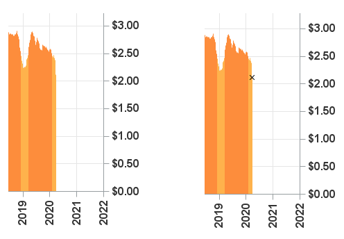
There are multiple ways to add a marker to a graph, in both R and SAS ... In this R example, I created a 2nd dataset, containing only the one row of data for the last (most recent) value. I then overlay the point on the graph, plotting data from just that dataset.
max_day_data <- my_data %>% filter(date==max(date))
geom_point(data=max_day_data,shape='cross',size=2,color="black") +
In SAS, I added an extra variable to the main dataset, only containing a value for the last (most recent) value - all the other rows in the dataset have a 'missing' value. I then overlaid the 'x' marker on the SGplot using a scatter statement. Note that in SAS, the data for all the plots being overlaid in SGplot must be in a single dataset (you could use a 2nd 'annotate' dataset to overlay a marker, but that's a different technique).
data my_data; set my_data end=last;
if last then do;
final_price=gasoline_price;
end;
run;
scatter y=final_price x=date / y2axis markerattrs=(size=7px color=black symbol=X);
Insert Calculated Values in Footnote/Caption
It's difficult to estimate what the ending date for the last data point is by just looking at the graph. Therefore I programmatically determine the values, and display them in a text footnote/caption below the graph.
In R, I use the max() function on the max_day_data, and create variables for max_date and end_price. I then use the labs() function to create a text caption label below the graph, with those values inserted into the text.
max_date <- max(as.character(max_day_data$date, format="%B %d, %Y"))
end_price <- max(dollar(max_day_data$gasoline_price))
labs(caption=paste("Data source: eia.doe.gov ",max_date," (ending price = ",end_price,")")) +
In SAS, I use Proc SQL to determine the values with the maximum date, and save them into macro variables. I then use those macro variables in a footnote statement.
proc sql noprint;
select put(max(date),worddate.) into :max_date separated by ' ' from my_data;
select put(gasoline_price,dollar5.2) into :end_price separated by ' ' from my_data having date=max(date);
quit; run;
footnote2 h=9pt font='albany amt' color=gray77
"Data source: eia.doe.gov &max_date (ending price = &end_price)";
My Code
Here is a link to my complete R program that produced the graph.
Here is a link to my complete SAS program that produced the graph.
If you have any comments, suggestions, corrections, or observations - I'd be happy to hear them in the comments section!


1 Comment
Pingback: SAS graphs for R programmers - diverging bars - Graphically Speaking